Maryland State Education Association
The Challenge
When you’re the largest professional organization in your state, people take notice, especially when you fight for educational equity and quality.
But since the Maryland State Education Association last rebranded in 2009, the public education landscape has shifted. MSEA needed a redesigned logo and brand platform to represent the energy and activism of its members — in 2020 and beyond.
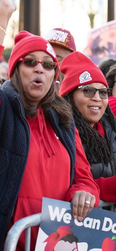

75KMSEA's membershipMany of the fivers who worked on this project have a strong connection to public education, with kids in the Maryland system or family members who are educators. When you work on something you passionately believe in, it never feels like work.
Research
As with every idfive project, we started with research. MSEA wanted a broad range of voices included — from the Board of Directors to rank-and-file members. Using our Discover360™ process, we surveyed 309 members, conducted focus groups and audited existing MSEA communications. To understand the design landscape of education advocacy groups nationally, we created brand wheels of comparator organizations, like the one for the National Education Association.
Positioning
We used the findings from the Discover360™ to inform the redesign logo and update MSEA’s brand position, value proposition, and tone and voice. The aha moment: Survey responses and focus group interviews showed strong alignment around MSEA’s advocacy mission.
MSEA’s updated brand position and tone and voice guidelines reflect that alignment.
Brand Position
The Maryland State Education Association — the largest union in Maryland and an affiliate of the largest professional union in the country — advocates with and for 75,000 employees of the state’s public schools to elevate the quality of Maryland public education and enhance the education profession in the state.
Tone & Voice
We are…
Passionate, not unreasonable.
Professional, not exclusive.
Assertive, not strident.
Optimistic, not unrealistic.
Urgent, not knee-jerk.
Design
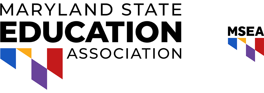
MSEA’s redesigned logo — the result of a collaborative, iterative process — is a refined, type-based mark that balances classic qualities with modernity and forward thinking. Graphic elements represent multiple constituencies coming together to advocate for education in the state. The bold primary color palette reflects MSEA’s values and brand personality — assertive, passionate, optimistic, and professional.
The Result
A clean, modern logo that reflects MSEA’s professionalism, vitality, and vision. And, as a result of extensive research and ongoing collaboration, a revised messaging platform and brand guide that aligns MSEA’s messaging with its critical mission.
Up Next
Personal Pathway™ campaign.

American College of Financial Services
View Case StudyThere’s amazing potential for good in the world. Let’s give it a chance and a voice.