Brand Higher Education Web Design
What Marketers Can Learn From The Worst Higher Education Website Ever

By \ August 29, 2017
It seemed highly unlikely that web brutalism, a design style that is intentionally clunky, ugly and outdated, would ever be embraced by a college or university.
It’s the antithesis of contemporary design, essentially revisiting everything the web building community was doing wrong in the late 90’s to early 2000’s. But while it’s not a very practical movement, web brutalism has forced the design community to think about the ways in which popular trends can not only limit innovation and creativity, but can also dilute that impact of a site that looks so much like every other site in its category.
Think of contemporary web design as the American suburbs. Simple, pleasant, uniform and universally respectable. The “web brutalist” design aesthetic, by contrast, forces us to look at the “suburbs” as something different: boring, aesthetically superficial, mass-produced and born from conformity.
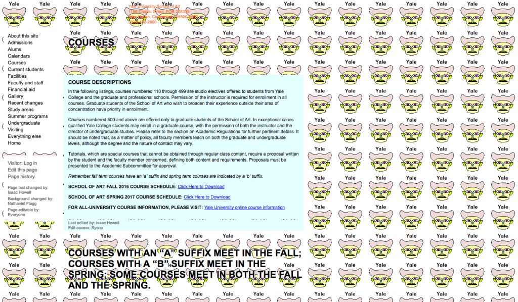
Generally, higher education websites sit more on the suburban end of the spectrum — easy to use and familiar, aesthetically pleasing (or at least inoffensive), true to the school but very rarely artistically provocative. Yale University School of Art, on the other hand, took the web brutalist approach, building a website in 2012 that would have gotten a big F as a final project at most design schools.
The audacity of the centuries-old Ivy League school reminds us of a very important marketing lesson that we often forget, especially when it comes to higher education.

When “Bad” Works
It’s easy to point out the flaws in the Yale School of Art website. It’s a garish, slapdash piece of work that defies the design, development and UX standards that have been established as “best practices.” But despite its seemingly-amateurish form, a closer look will reveal that it actually accomplishes everything we want a website to accomplish.
The navigation, though adding to the ugliness of the design, is comprehensive and orderly. The visual design, while entirely unattractive by contemporary standards, has a postmodern, ironic sort of feel that appeals perfectly to the creative minds of art students. Most surprisingly, the website is a Wiki. Anyone — students, faculty, staff, alums, and random visitors — has the ability to change most of the site’s content and add new content and pages. With the target audiences in charge, the website inherently has all the information it needs, and if any of that content is somehow buried under links, these users are likely to unearth it. So, yeah. It’s highly usable, too.
When considering the art school’s brand, the website also checks out. Yale can afford to have a website that doesn’t look prestigious or impressive, because everyone knows that the school is prestigious and the student work is, in one way or another, impressive.
But most importantly, the school also knew that their students would be clever enough to get the joke. Which brings us to a very important question… to what extent can your school trust your prospective students to pick up on unconventional, outside the box marketing?
Why We Play It Safe
The blunders committed in the previous few decades of higher education marketing — inauthentic stock photography, platitude-filled viewbooks (Small classes! World-class faculty!), students chorusing the school slogan at the end of a promotional video — can all be attributed to the “playing it safe” approach.
Though even if past marketers were playing it a bit too safe, little harm was actually being done. College was far less expensive, it led to higher paying jobs, and it had a reputation of being fun, exciting and respectable. No corny viewbook could change that.
Now we’re in a different era. College isn’t cheap, which means the fun aspect is being rightfully overshadowed by the beneficial aspect, and both the undergraduate and graduate students being recruited are naturally skeptical of advertising, especially when it’s coming from the routine voice of a college or university.
The antidote to this skepticism isn’t to play it safe, but to create a more genuine connection with an honest and novel approach. Sometimes, this means you need to play outside the box. These tactics could be as daring as a brutalist website or as low risk as a sarcastic email subject line. But no matter what your tactic is, you need to be able to trust your audience to get it. And this can only be done by understanding them, inside and out.
Build Trust With Understanding
There’s a gauntlet in higher education marketing lined with stakeholders, administrators and board members where an abundance of “risky” tactics have met their demise. The best chance you have at surviving it is with a smart strategy. In marketing, this starts with understanding your audience.
If you know your audience — how they think, what their opinions are, what they see as being genuine — then your marketing can be more precise and possibly more unconventional. Knowing them means knowing that they’ll “get it,” no matter how far out “it” might be.
To the country’s top prospective art students, a website as unconventional as Yale’s is actually pretty appealing–though the same approach probably wouldn’t work for a business major. On the other hand there are certain references and messages that a prospective business student would find engaging and relatable. Once you pin-point these different audience characteristics, then you can match them up with your brand’s personality.
Yale School of Art is obviously a bit counter-culture, but other art schools might be minimalistic or tech focused. Likewise, a business school may have a startup feel or a math department may be unapologetically nerdy. These unique personalities can all make for bold, fun and honest marketing, but only if they’re shown to the right audience, and only if you know enough to trust that audience.
If you can do that then your unconventional marketing won’t seem risky at all. It’ll just seem smart, like Yale University School of Art’s website.