Design User Experience Web Design
A 3-Step Guide to Making Your Website More Accessible With Color

By \ July 18, 2018
How much do web-accessible color choices matter? More than you might think. Ask the 8% of men who have some type of color blindness, or anyone with low vision or a visual impairment like cataracts or glaucoma. Screen brightness and resolution even affect general users — think of using your phone in bright sunlight vs. indoors.
Search engines like Google recognize the need for accessibility and will punish your website with a low search ranking if it’s not compliant with accessibility standards. While color choice is just one part of website accessibility, it’s a big one.
So, are the colors on your website accessible? Here’s an easy way to find out — and make changes if needed. Just follow our quick 3-step process.
Step 1: Understand AA and AAA compliance for text.
Accessible color choices rely on sufficient contrast. There are two levels of color contrast compliance for text from the WCAG (Web Content Accessibility Guidelines): AA and AAA. All text should be a minimum of AA, which means the lighter color has 4.5 times as much luminance (how bright it looks) as the darker color. Level AAA is stricter, requiring the lighter color to have 7 times as much luminance.
Font size and weight also matter. The WCAG uses these values as guidelines:
- Large text: 18pt (about 24px) and larger, OR 14pt (about 18px) and bold.
- Normal text: 14pt (about 18px)
- For more on the difference between pt vs. px values and differences between fonts, here’s a comprehensive explanation.
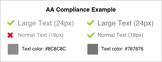
Sometimes a color for large text won’t work for body text. In the example below example, text that is #8C8C8C at 24px on a white background meets AA. But the same color text at 18px doesn’t pass. Going slightly darker to #767676 gets it there. Sometimes it only takes small adjustments.
Step 2: Check your compliance.
If you have an existing site to test out, the WAVE Evaluation Tool is a helpful Google Chrome extension. Once installed, go to the site and click the extension icon. For example, let’s use the homepage of the marketing automation service, MailChimp:
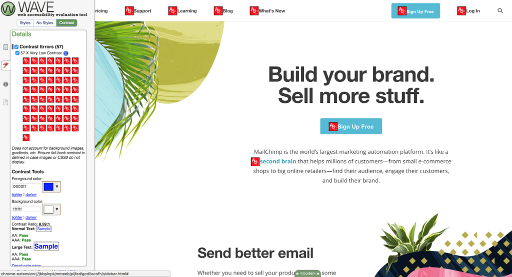
The sidebar that appears flags all accessibility errors, not just color contrast. To just see contrast errors, click on the “Contrast” tab. We can see there are several! Let’s focus on the buttons:

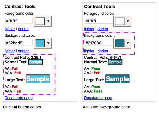
Clicking the red icon shows you the foreground color (the text) and background color in the sidebar, which fail AA all around. If you click the “darker” link for the background, you can see how much adjustment is needed.
Step 3: Adjust color choices and design
Once you’ve identified the inaccessible colors on your website, select new ones. A few tools to help you quickly pick alternate color choices that work better — and still look great:
This is an excellent tool to fine-tune color combinations. Let’s test it out on the MailChimp button colors:
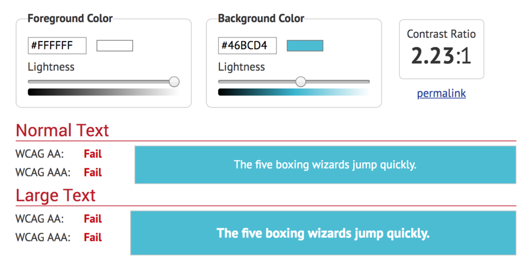
As you can see, the button colors are neither AA or AAA compliant. But by adjusting the lightness, you can find a color that passes and is still close to the original brand design. A color picker is available to change the colors as much as you need (just click on the small rectangular swatch by the hex code).
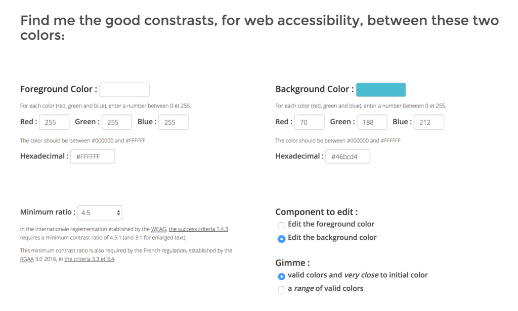
Instead of doing the fine tuning yourself, this tool generates alternatives for you. You can edit the foreground or background color, and get new colors that are close to the original or show a wider range.
Create a color palette using existing colors
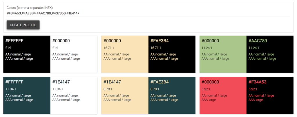
Sometimes there are brand colors you need to stick to. If so, you can narrow down several color combinations quickly.
Just put in hex codes of the brand colors you want, and this tool will generate many options with compliance levels.
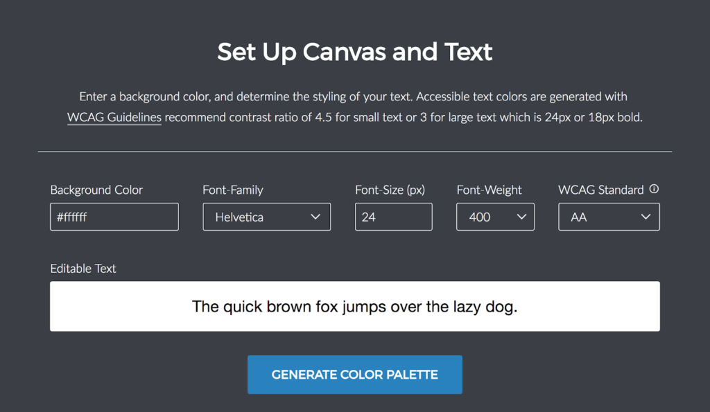
In addition to finding a wide range of accessible colors, this tool also lets you play with font options. Sometimes just changing the size or weight of your text can make all the difference. Pro tip: For lower contrast designs, consider increasing the font size and/or weight, especially if you’re using a thinner font.
Making web-accessible color choices doesn’t have to be hard or limiting, and it comes with plenty of benefits to your organization and your audience.
The web world is far more conscious of accessibility than it was even a few years ago. Search engines are cracking down on websites that don’t meet accessibility standards and web specialists advocate for its ethics.
Make accessibility a standard for all your web products. Not only will you be contributing to a more supportive, equal internet, you’ll also ensure a high quality user experience for all audiences.
Pat is a detailed-oriented UX and graphic designer who loves to nerd out over data and user behaviors. It’s what makes her so adept at building an empathetic digital experience and at working with developers to create sites that aren’t just beautiful, but that get results. Pat is an excellent collaborator and invites feedback from across the agency. And when it comes to effective documentation, best practices, or all things Outlander, Pat is your girl.