Advancement and Fundraising Nonprofit Web Design & Development
Achieve Your Fundraising Goals with the Perfect Donation Form

By \ February 25, 2019
As a mission-based agency, we partner with clients from non-profits and universities, who are looking to raise money on an ongoing basis or part of a larger advancement campaign.
An often overlooked component of a fundraising website is the donation form itself. Research from around the web shows that donation form abandon rates can range from 50–80%. Like it or not, your organization can have the most emotional, empathetic website, but if your donation form has issues, then you’ve failed.
Follow these recommendations to help streamline the giving process for your next fundraising website.
Break the Form into Chunks
It may sound made-up, but “chunking” is a technical UX term. By breaking large amounts of information into smaller, manageable chunks, users (or in this case, donors), can process information faster. This is fundamental to building a good donation form. If something looks long, it’s going to feel difficult and intimidating. Users will become frustrated, or worse, decide the hassle isn’t worth it and leave the site entirely.
The easiest way to apply chunking to a donation form is to break it into steps. Doing so creates the impression that it is shorter and in turn, less difficult to complete. This can be done by hiding text boxes and inputs through progressive disclosure, similar to an onboarding wizard. Alternatively, you can achieve this effect within a single page using whitespace and typography/color to establish a clear visual hierarchy.
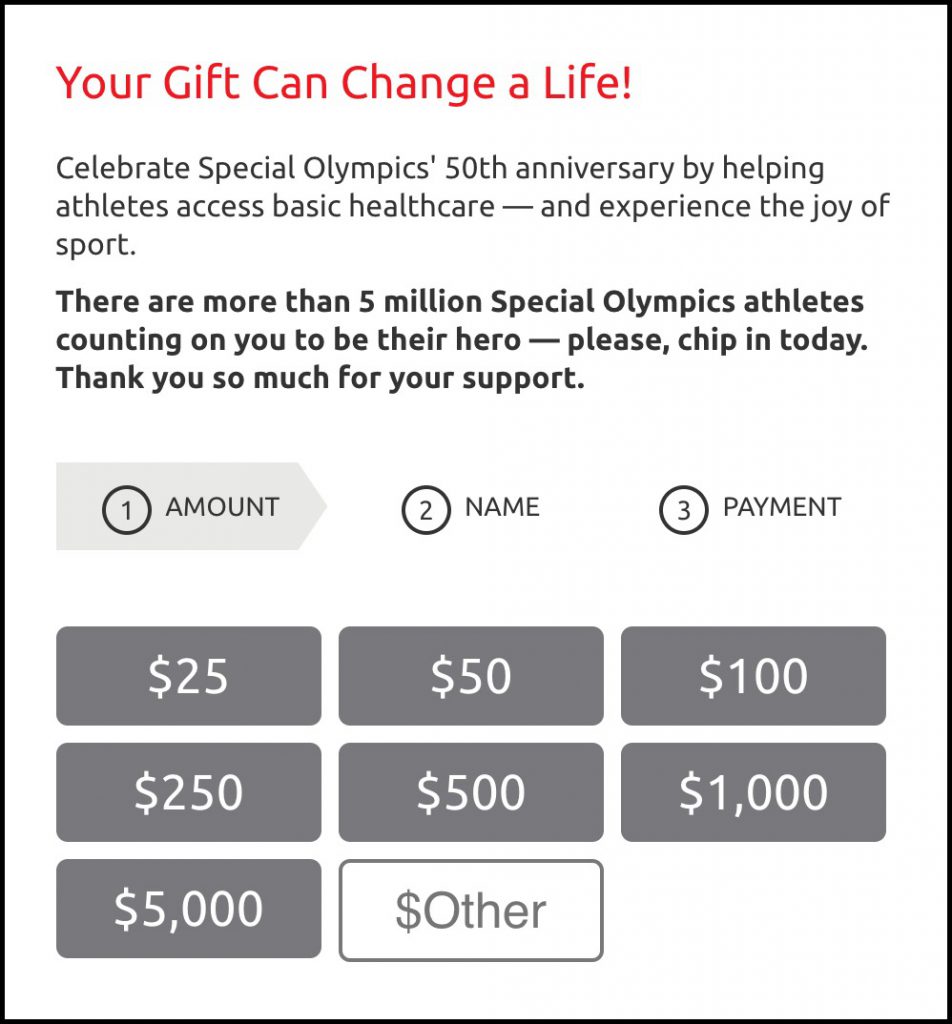
The parts of a donation form naturally lend itself to be separated into three steps: the donation amount, a donor’s personal information, and payment method. For example, Special Olympics, shown below, does a great job of this. Not only did they separate the form fields into the three steps, but they clearly communicate that there are, in fact, three steps and what each step is.

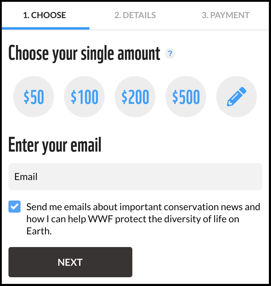
Another way to chunk a donation form is to use a micro-form. With this approach, the full donation form is found on the donate page, but the first step is included on the homepage (or any other pages, as necessary). Clicking the button takes users to the donate page with their dollar amount already in place. This makes the process feel easier because the form is already partially filled out when users arrive.

Provide Suggested Donation Amounts
Price anchoring is a technique used in ecommerce where customers are shown price point(s) as a reference for determining value and/or how much to pay. This practice helps increase conversions and drive sales and is equally effective in fundraising. In your donation form, give donors suggested dollar amounts instead of simply an empty text box. When doing so, use a few options (maybe three-to-five) in conjunction with the ability to enter a custom amount.
These amounts should be representative of average donations—either the current average or one that’s aspirational, but realistic. But be cautious—set these preset values too high and it could alienate donors when asked to contribute an amount well beyond their budget. The amounts you pick should reflect the fundraising goals of your organization while also being appropriate for your target audience.

Be Stingy With The Questions
Putting together the donation form—from the type of questions to their order and format—can be challenging and is a task that shouldn’t be taken lightly. The questions you don’t ask are just as important as the ones you do. Limiting the length of your web forms creates a better user experience and but also helps your organization realize business goals. For instance, research from the marketing software company Hubspot has shown that reducing the number of fields on your donation form can increase conversions by as much as 50%.
It can be tempting to ask donors for all sorts of information, but only include questions that are completely necessary. The reason for this is similar to why the form should be chunked; each additional text box or drop-down menu only makes the form feel that much more difficult. A few easy ways to shrink the donation form include:
- Avoid asking for comments and how donors were referred.
- Allow users to donate without creating an account.
- Encourage newsletter signups only after they have already donated.
For more best practices on web forms, this article showcases some of the more egregious mistakes that web designers make, and how to fix them.
Use the Thank You Page to Your Advantage
There’s never a better time to get additional information or engage with your audience than right after they’ve donated. Use this opportunity to encourage donors to share to their social network that they’ve made a gift. Ask them to sign up for your newsletter. Provide additional stories of impact to further connect with your organization. If appropriate, encourage users to attend a larger fundraising event or gala. At the minimum, use the thank you page as a way to reinforce your brand and include a thoughtful, personalized thank you message.
Bonus Points: Allow for Alternative Donation Methods
Including payment options other than credit card can be a boon for organizations looking to raise money. The simplest way to do this is to give potential donors the option to contribute using modern payment methods such as Paypal or Venmo, for the times when they may not have their credit card handy.
Text to Donate is another simple, low-barrier option for fundraising. The 2016 Bernie Sanders presidential campaign leveraged this with great success to not only collect small-dollar donations but to grow their digital subscriber list substantially. It’s important to note that these methods may have transaction fees; however, one option to address this is to ask donors to cover any additional fees.
